Freight Ferry
Diploma of Graphic Design Project
Brand Identity
Communication
Campaign & Print
Concept Development
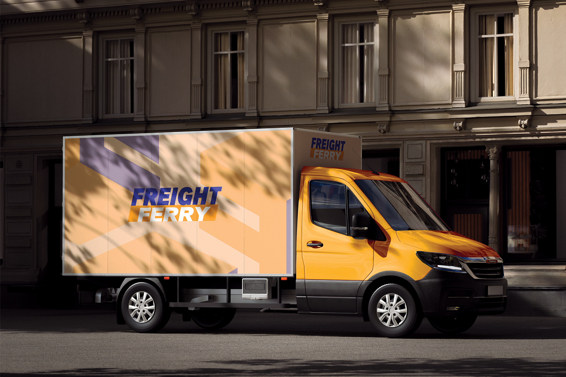
A structured visual identity was developed to represent trust, visibility, and movement. The system was designed to be adaptable across multiple touchpoints, ensuring consistency and clarity while supporting a cohesive and functional brand presence. The development also focused on creating a recognisable logo system.
Design Problem
Develop a brand that communicates speed and reliability within a highly functional industry, while also reflecting values of safety, sustainability, collaboration, innovation, and integrity. The identity needed to remain clear, professional, and flexible across different applications without losing meaning or impact.
Design Solution
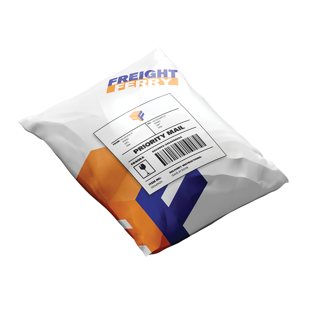
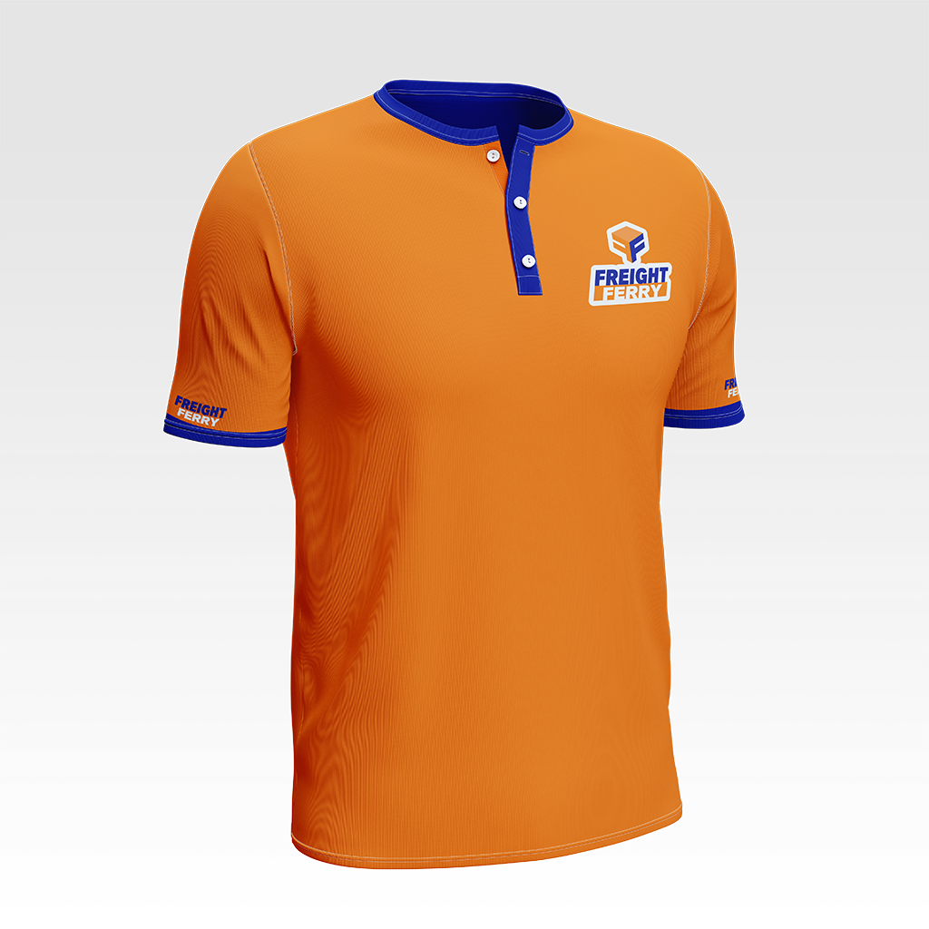
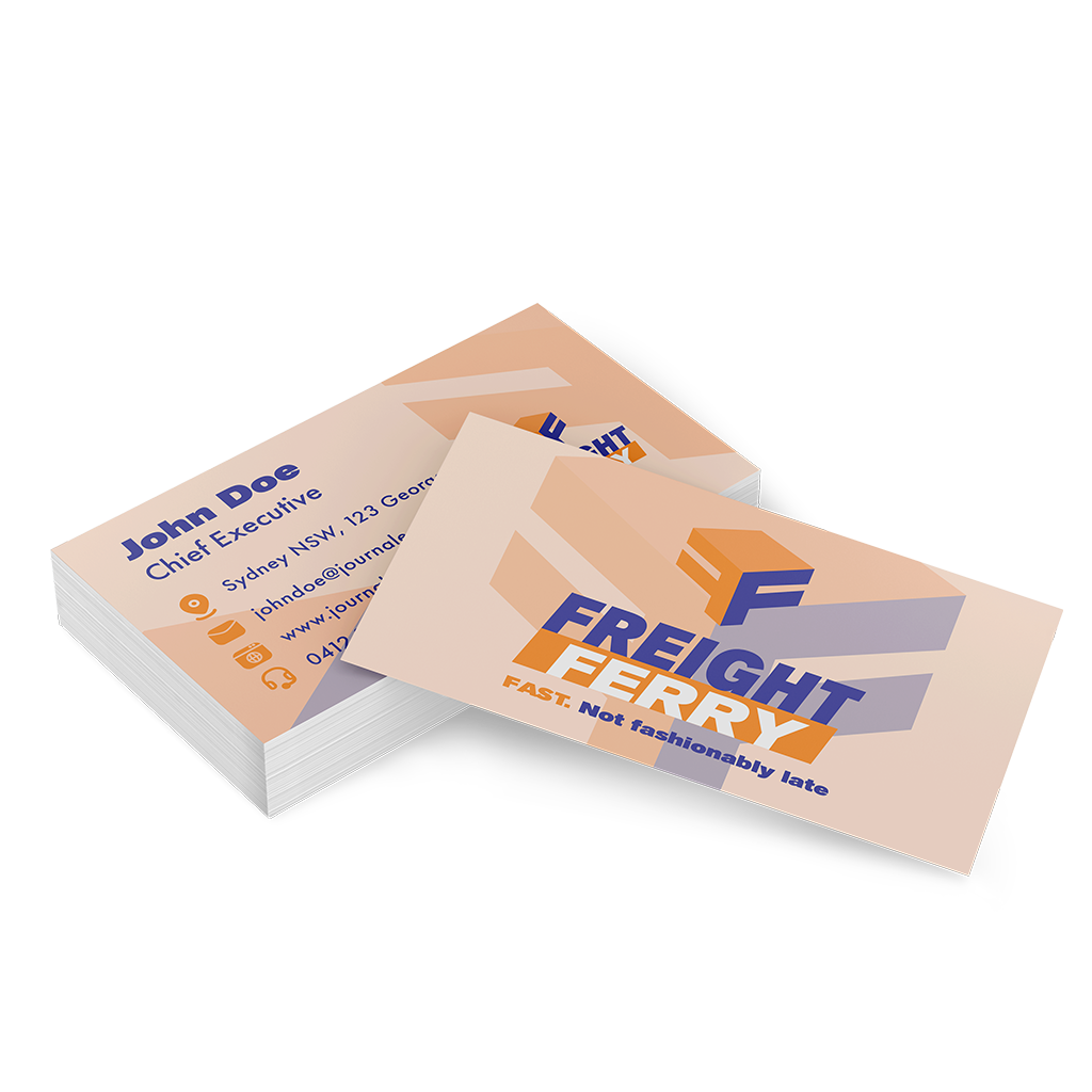
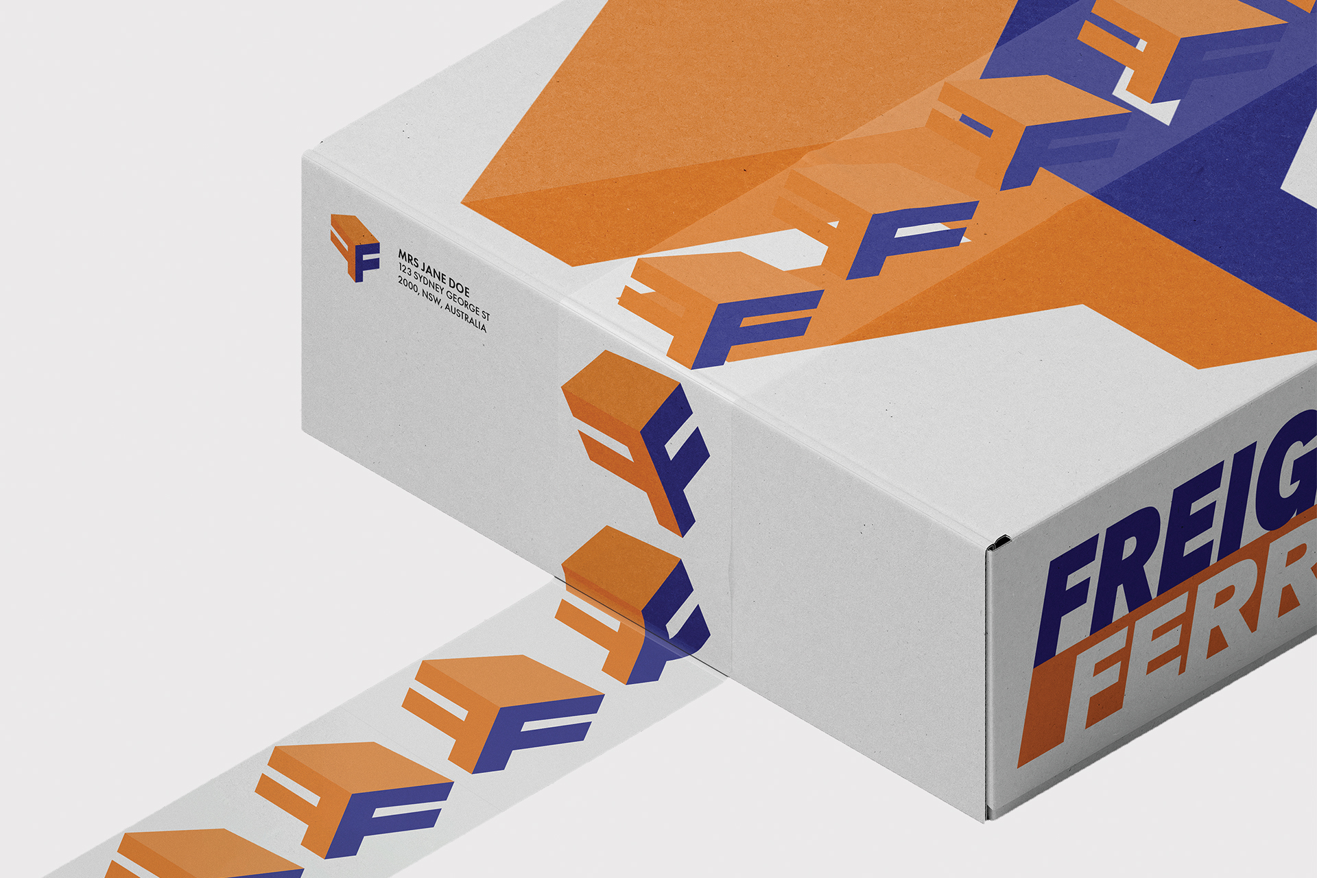
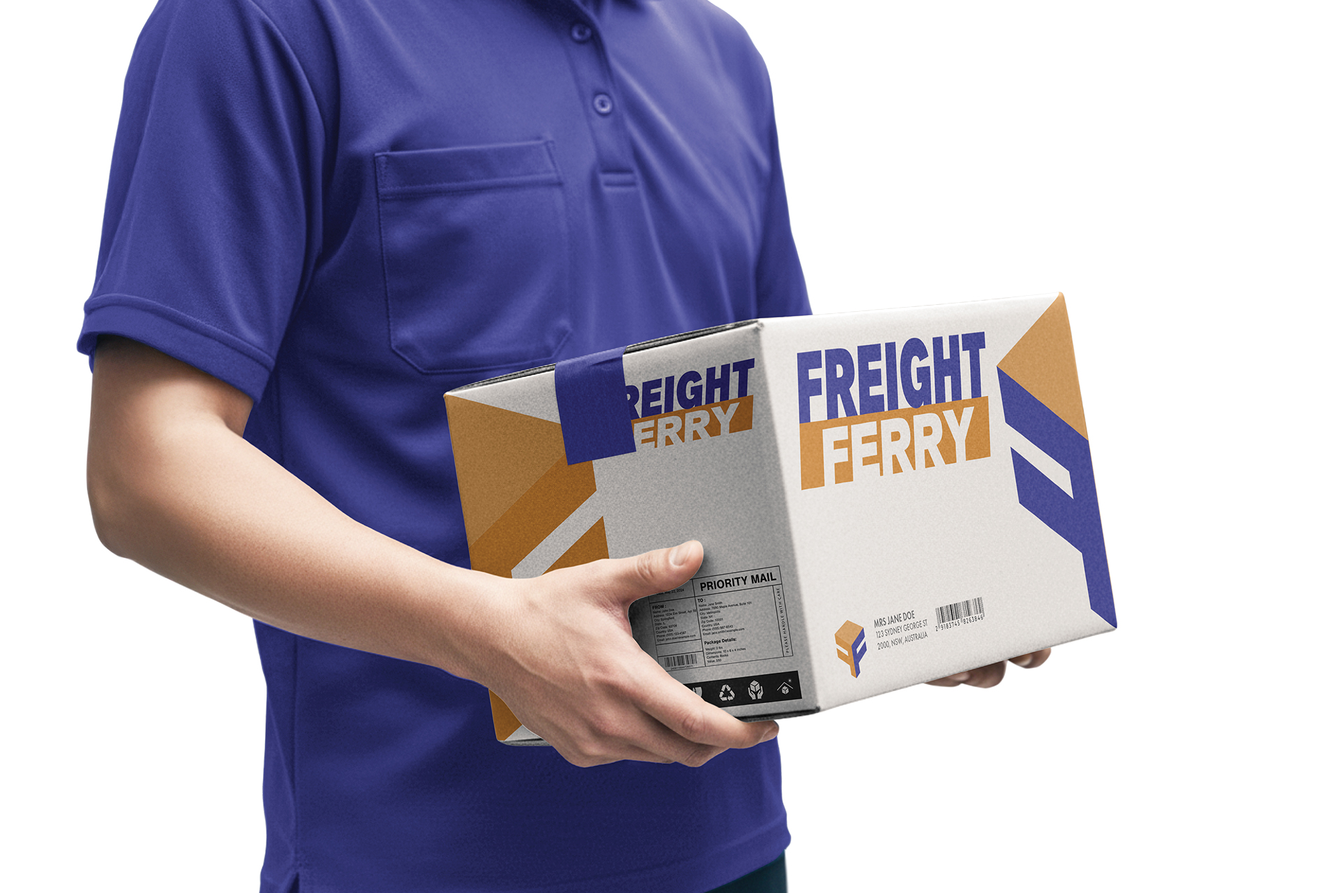
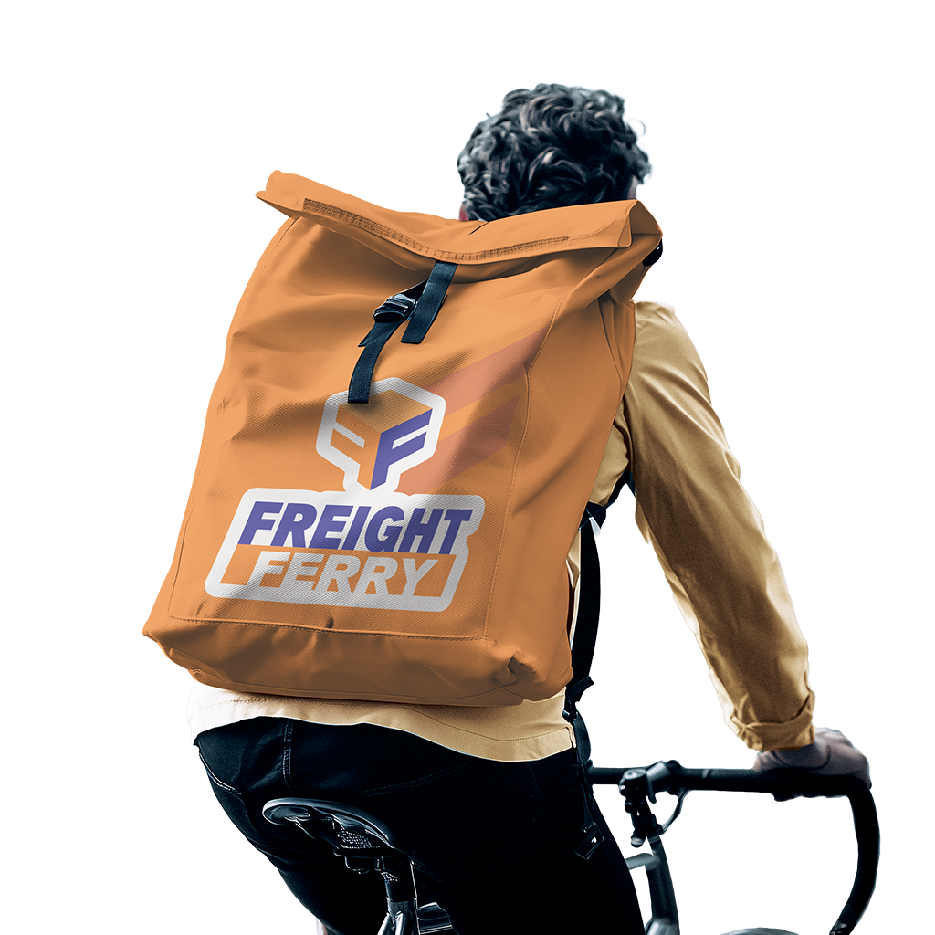
A cohesive and professional brand was created using a blue and orange colour palette, communicating reliability and efficiency while reinforcing broader values. The logo combines a box symbol representing courier services and structure, two “F” forms reinforcing the Freight Ferry name, and subtle arrows suggesting forward motion, speed, and scale.
Adobe Illustrator, InDesign and Photoshop and were utilised in this project.