Formed
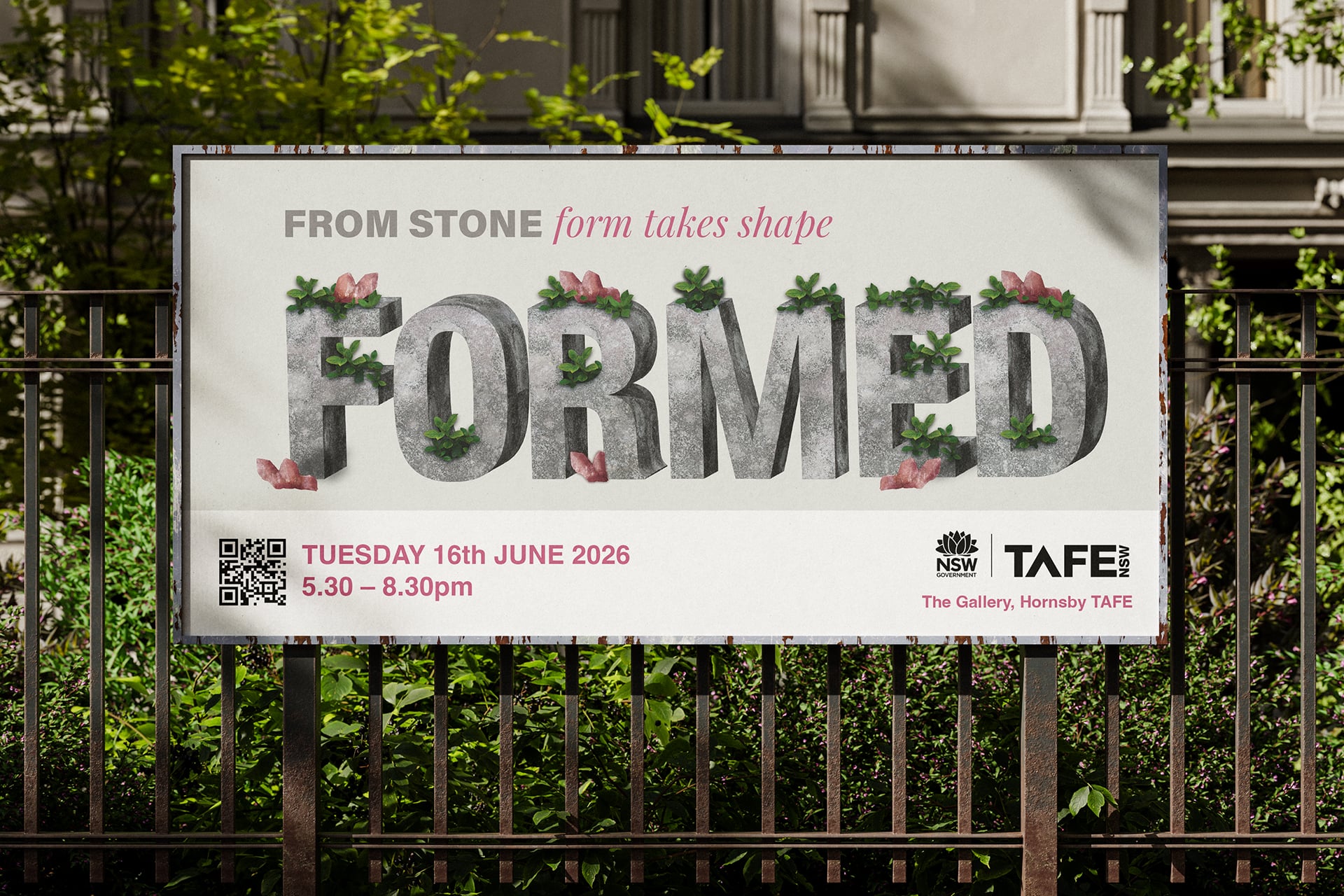
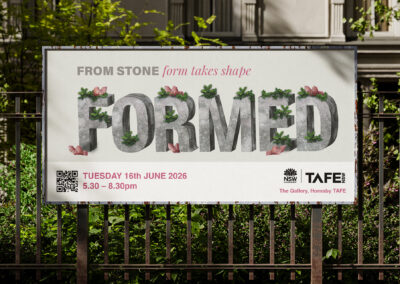
Formed is a showcase identity design created for a TAFE Diploma graduate showcase, exploring themes of transition, growth, and progression through a typographic-led concept centred on moving into a new chapter.
Client Project | Diploma of Graphic Design Project
Campaign & Print
Concept Development
The concept was developed around the symbolism of growth emerging from rigidity, representing progression through change. This contrast between natural and constructed elements shaped the typographic direction, resulting in a flexible identity that communicates transition, development, and forward movement.
Design Problem
The challenge was to develop an expressive wordmark-based identity that communicated the idea of closure and new beginnings. The design needed to reflect growth and progression while remaining suitable for both families and industry professionals attending the showcase.
Design Solution
The solution uses a typographic-led system inspired by the idea of nature emerging through stone, representing transformation through contrast between organic and structured forms. This concept informed an adaptable identity designed to work across print and digital applications, including invitations and large-format banners.
More Images Coming Soon! This project is still ongoing...
Adobe Illustrator, InDesign and Photoshop were utilised in this project.