Mermade
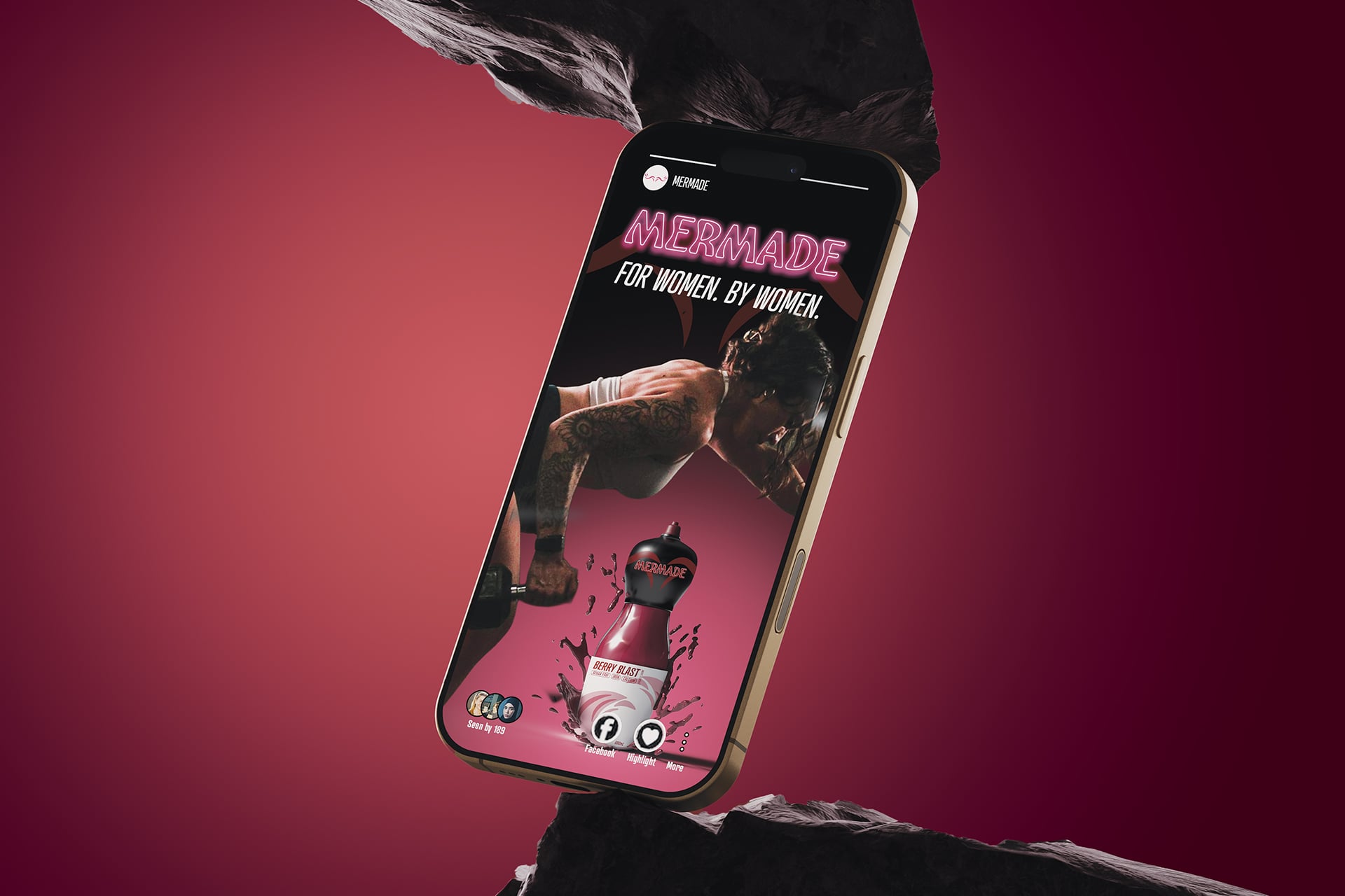
Diploma of Graphic Design Project
Brand Identity
Communication
Campaign & Print
Digital Design
Concept Development
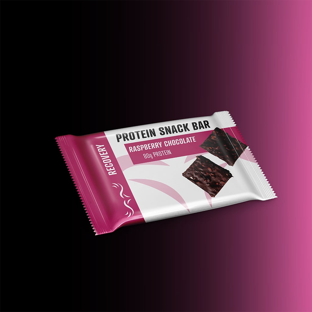
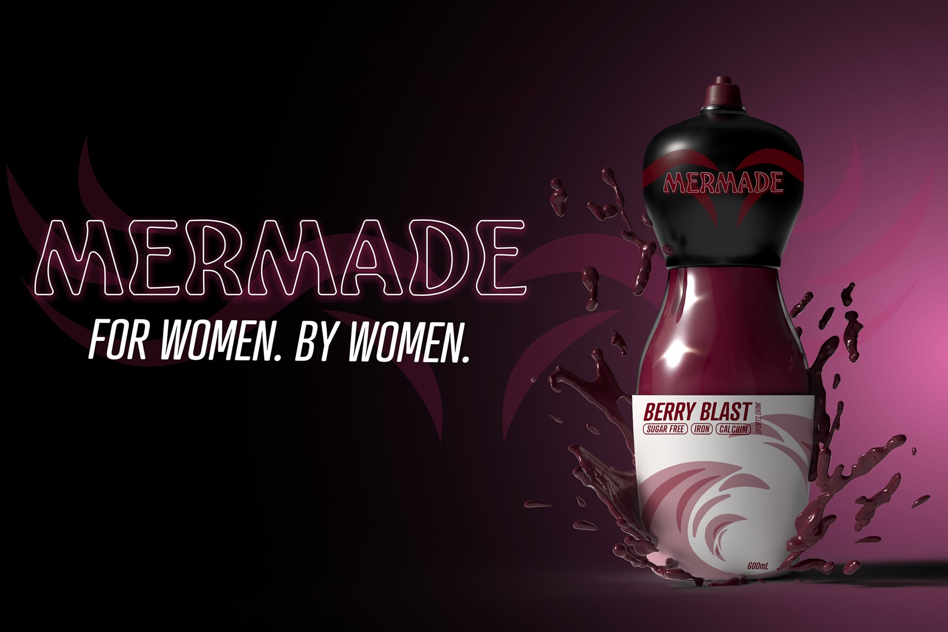
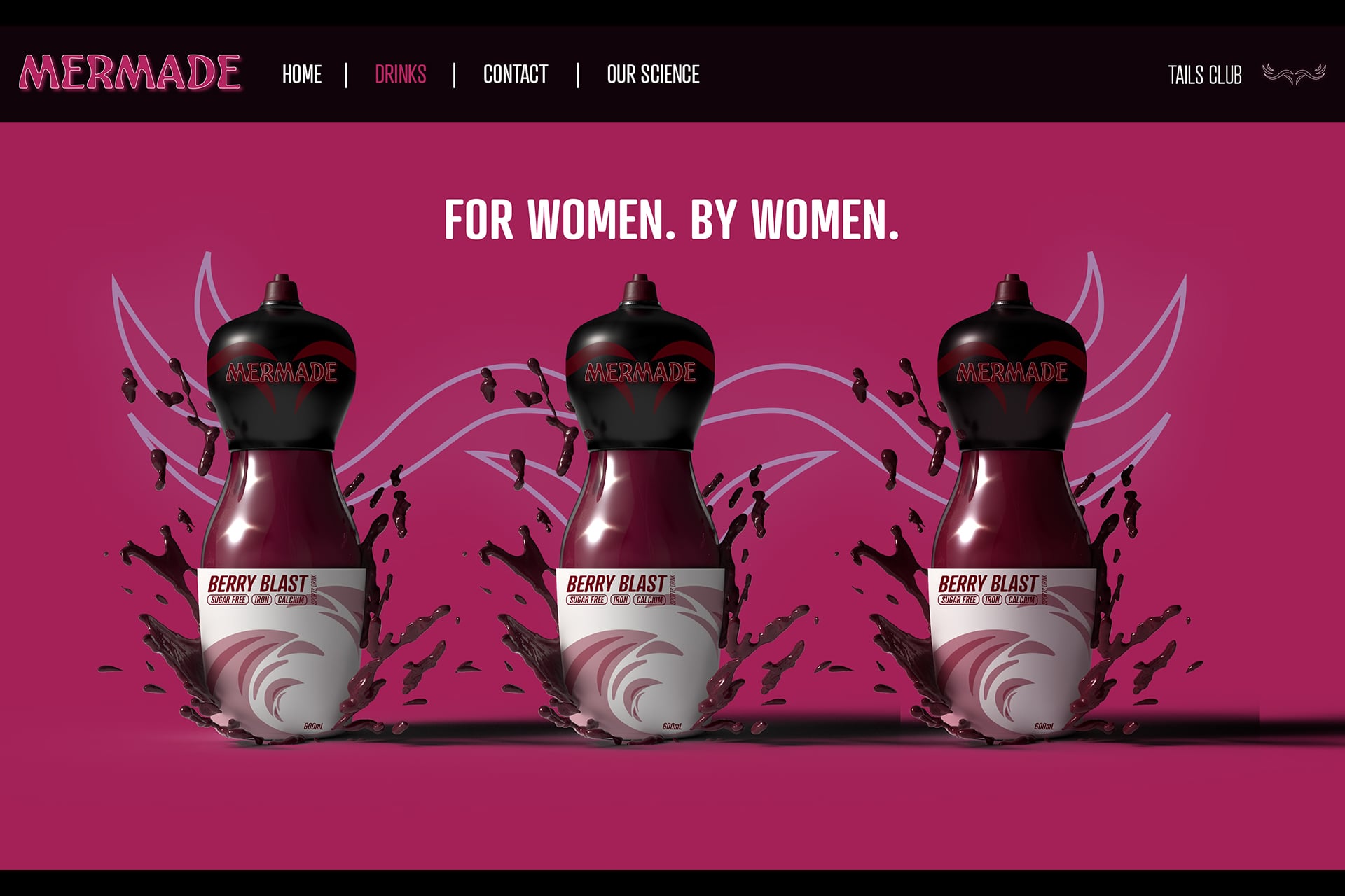
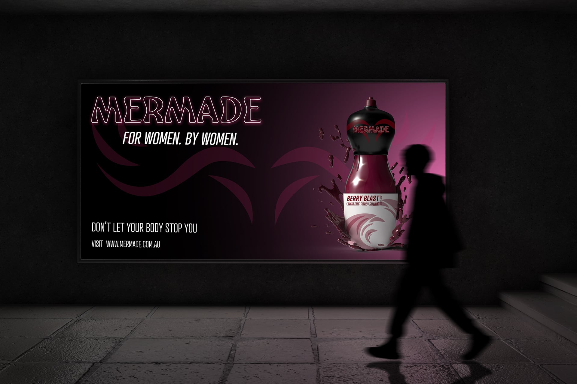
The brand was developed around femininity and empowerment, creating a visual identity that feels strong and expressive. A dark moody pink and black palette was used to balance softness with confidence, forming a distinctive aesthetic that avoids stereotypical representation while remaining feminine and considered.
Design Problem
The challenge was to create a clear point of difference in a crowded market while avoiding stereotypical or superficial approaches often used when targeting women. The brand also needed a clear unique selling point that felt intentional, cohesive, and meaningful across both product and identity.
Design Solution
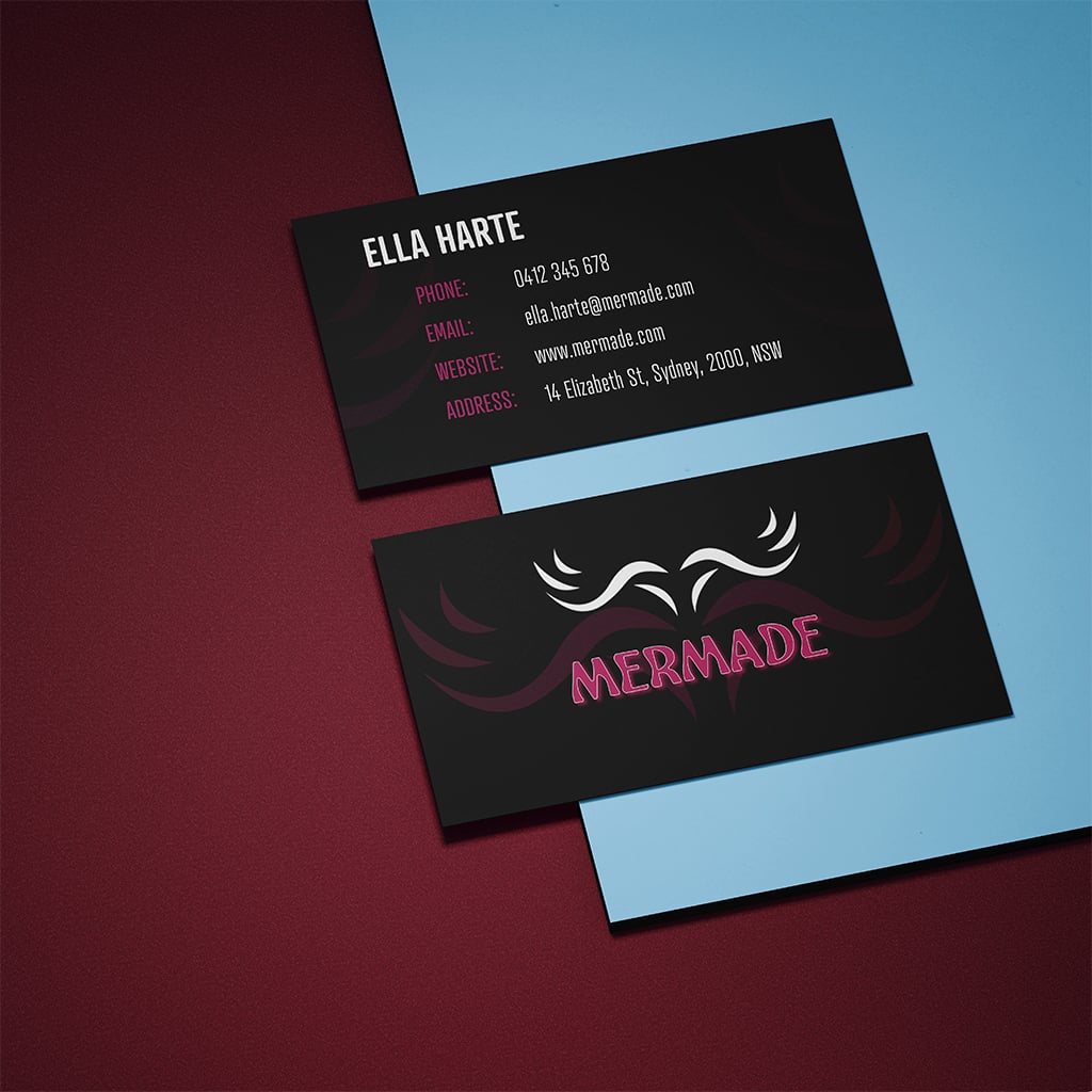
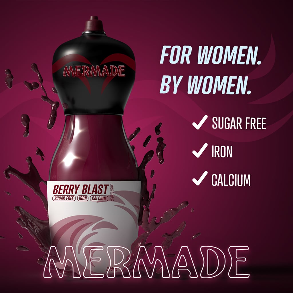
A cohesive brand was created grounded in both function and identity, supporting women’s nutritional needs through added iron and a carefully designed practical, ergonomic bottle design. The logo combines a mermaid tail symbolising young girls’ dreams and aspiration, and a wave form representing hydration.
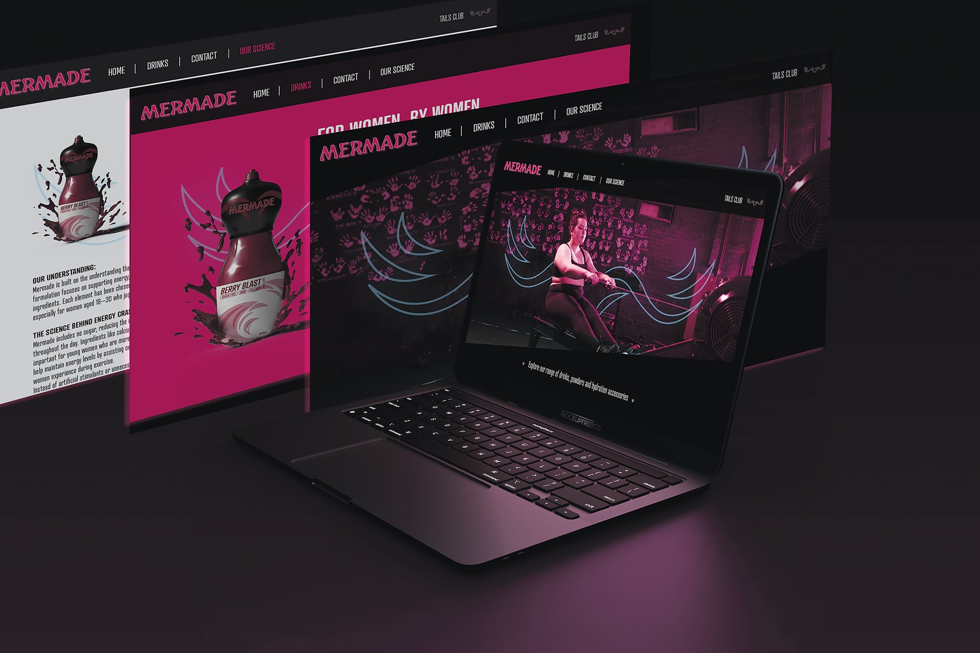
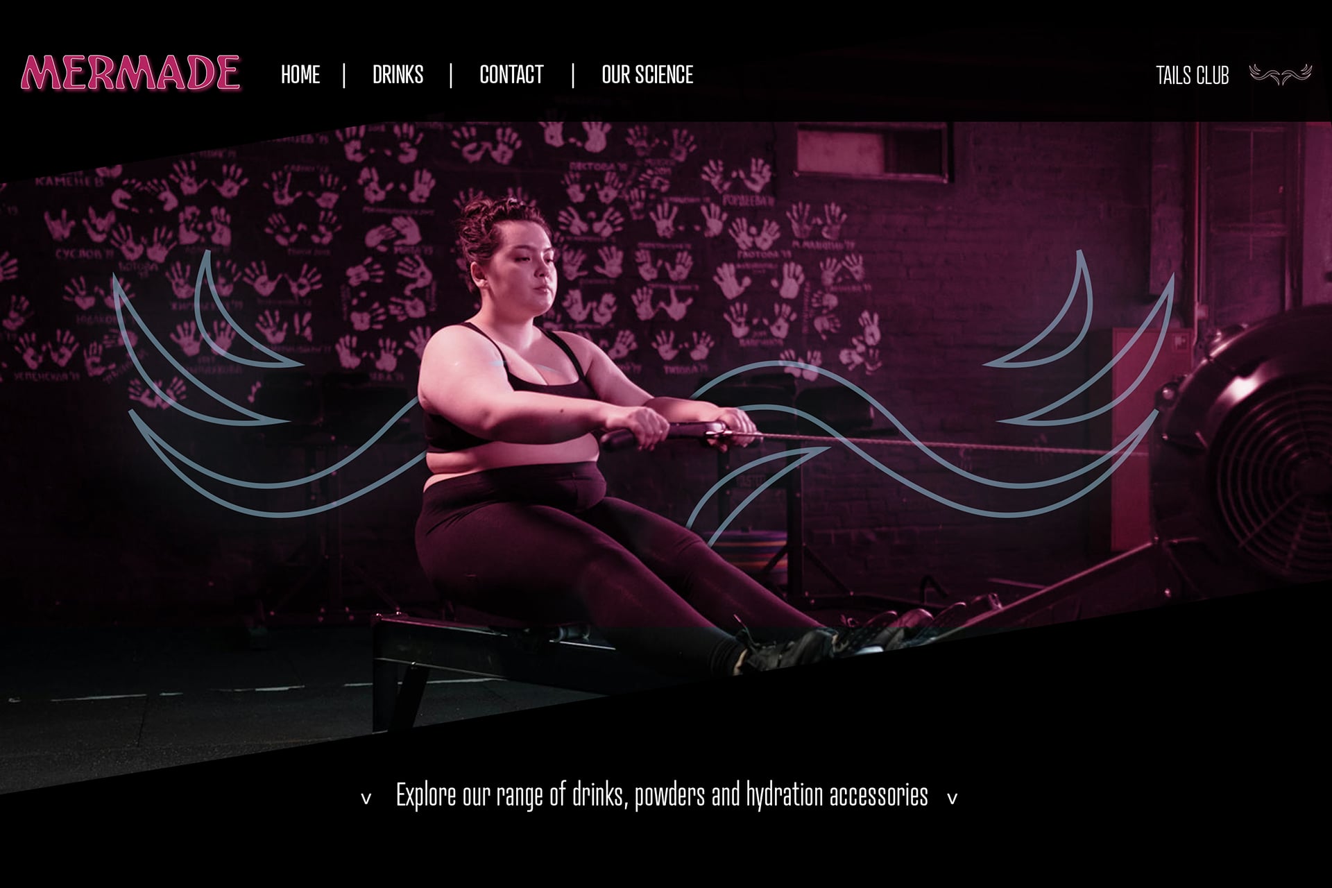
Adobe Illustrator, InDesign, Dreamweaver and Photoshop and were utilised in this project.