Alerion Medical Packaging
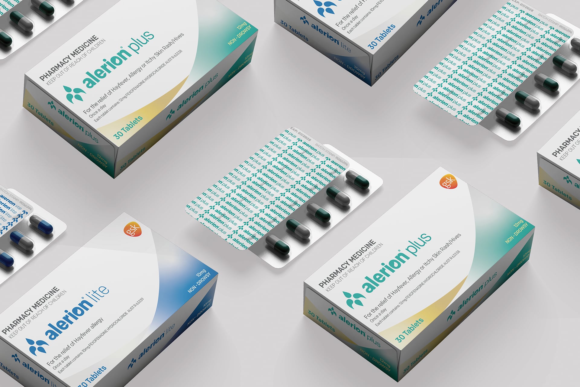
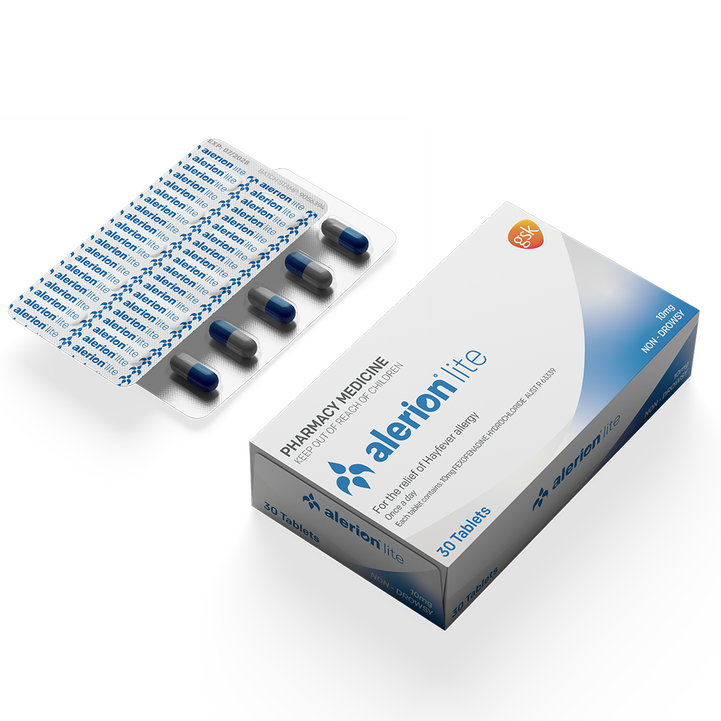
This project involved developing a packaging system for Alerion, a medical range designed for hayfever and allergy relief for both adults and children, across three variants: Lite, Plus, and Kids.
Diploma of Graphic Design Project
Brand Identity
Campaign & Print
Concept Development
Alerion was developed as a cohesive packaging system focused on trust and medical clarity, while maintaining clear differentiation across a product range. The aim was to create a structured visual language that felt consistent, functional, and easy to navigate.
Design Problem
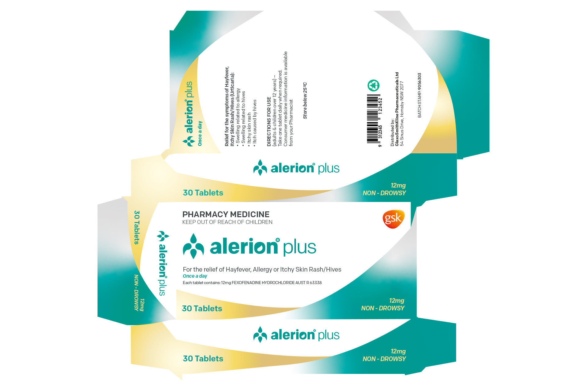
The challenge was to create a cohesive packaging system that communicates trust and clarity while still enabling distinct product differentiation across the range. This needed to be achieved without relying on heavy visual variation that could weaken cohesion or reduce readability across different SKUs.
Design Solution
A restrained palette of blue, teal, orange, grey, and white was used alongside a consistent layout system of clean forms and structured hierarchy. Product variants were differentiated through special print finishes (silver holographic for Lite, gold for Plus, and rainbow holographic for Kids).
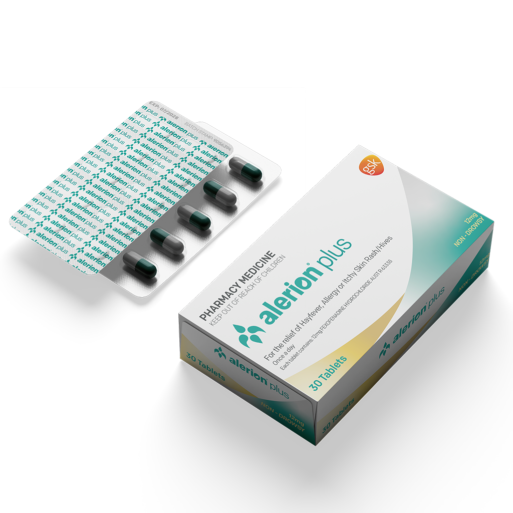
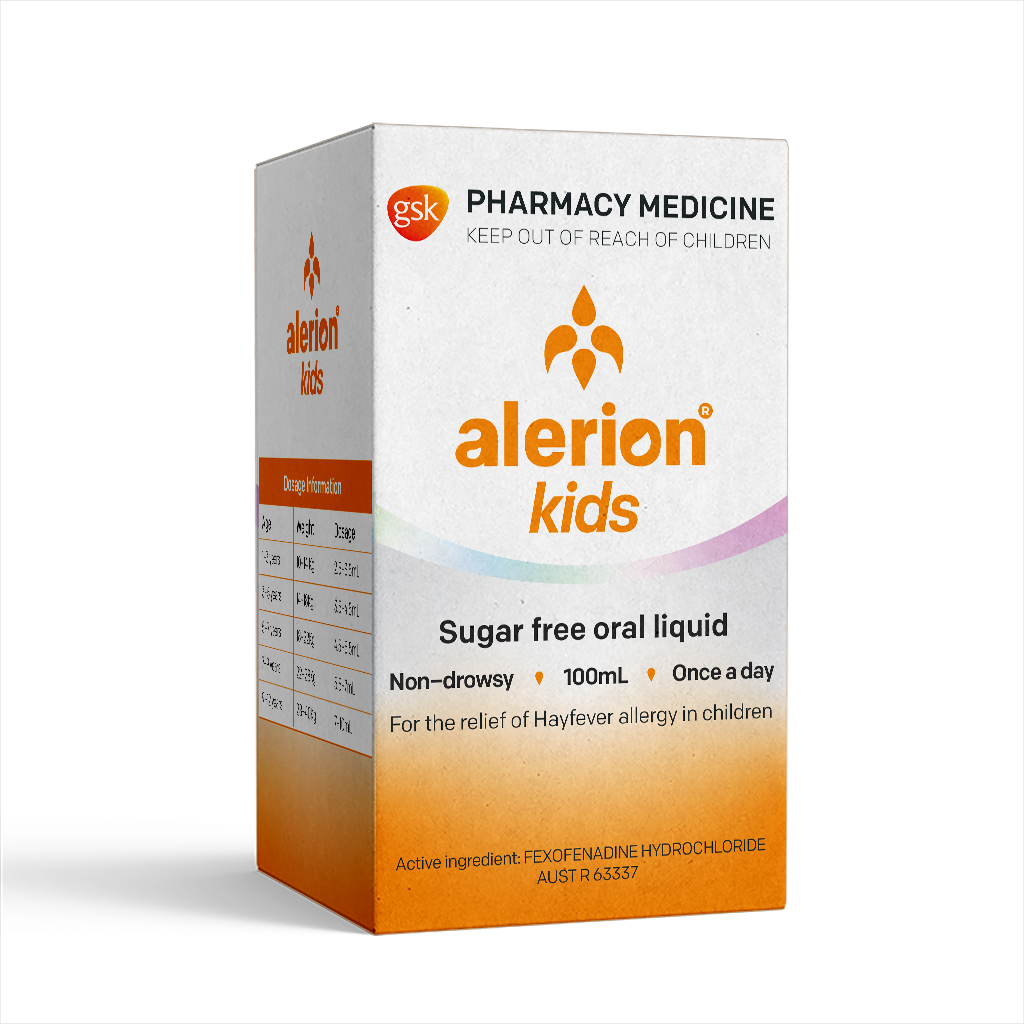
Adobe Illustrator and InDesign and were utilised in this project.