Wonderland
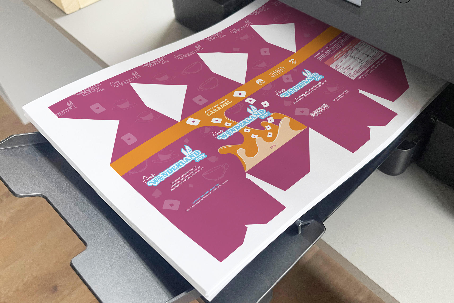
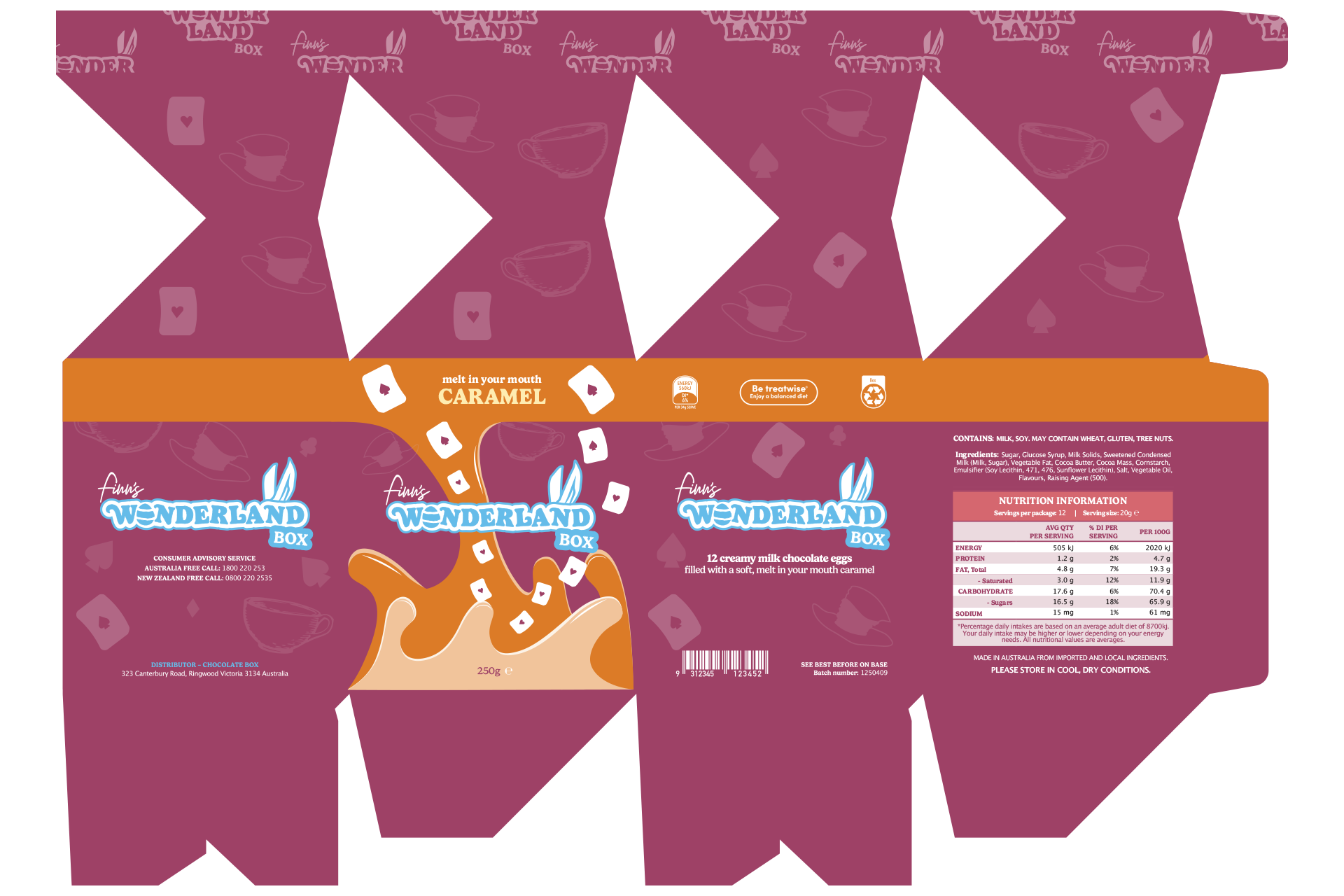
Wonderland Box is a conceptual Easter packaging in collaboration with Finn’s Chocolate, developed around an Alice in Wonderland theme.
Diploma of Graphic Design Project
Brand Identity
Campaign & Print
Concept Development
The project was developed to appeal to both children and parents, combining nostalgic storytelling with a colourful and playful visual style. A custom “Wonderland Box” wordmark was created alongside Finn’s Chocolate branding to form a cohesive co-branded identity, supported by a soft yet vibrant colour palette that feels both engaging and memorable.
Design Problem
The project required the creation of Easter packaging that could attract attention in a retail environment while balancing appeal for both younger audiences and parents. The challenge was to create a design that felt imaginative and fun without losing clarity or shelf impact. At the same time, the packaging needed to consider practical print production requirements, including the use of special finishes and effective visual hierarchy.
Design Solution
The final solution translated the nostalgic aesthetic of Alice in Wonderland into a visually distinctive packaging design with strong narrative appeal. I utilised a vibrant yet nostalgic colour palette and playful typography, to create a fun and engaging identity. The packaging was also designed with print production in mind, incorporating special finishesto ensure it functioned successfully as an eye-catching retail product.
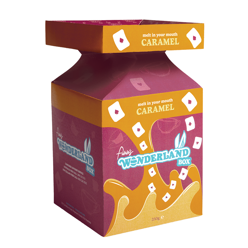
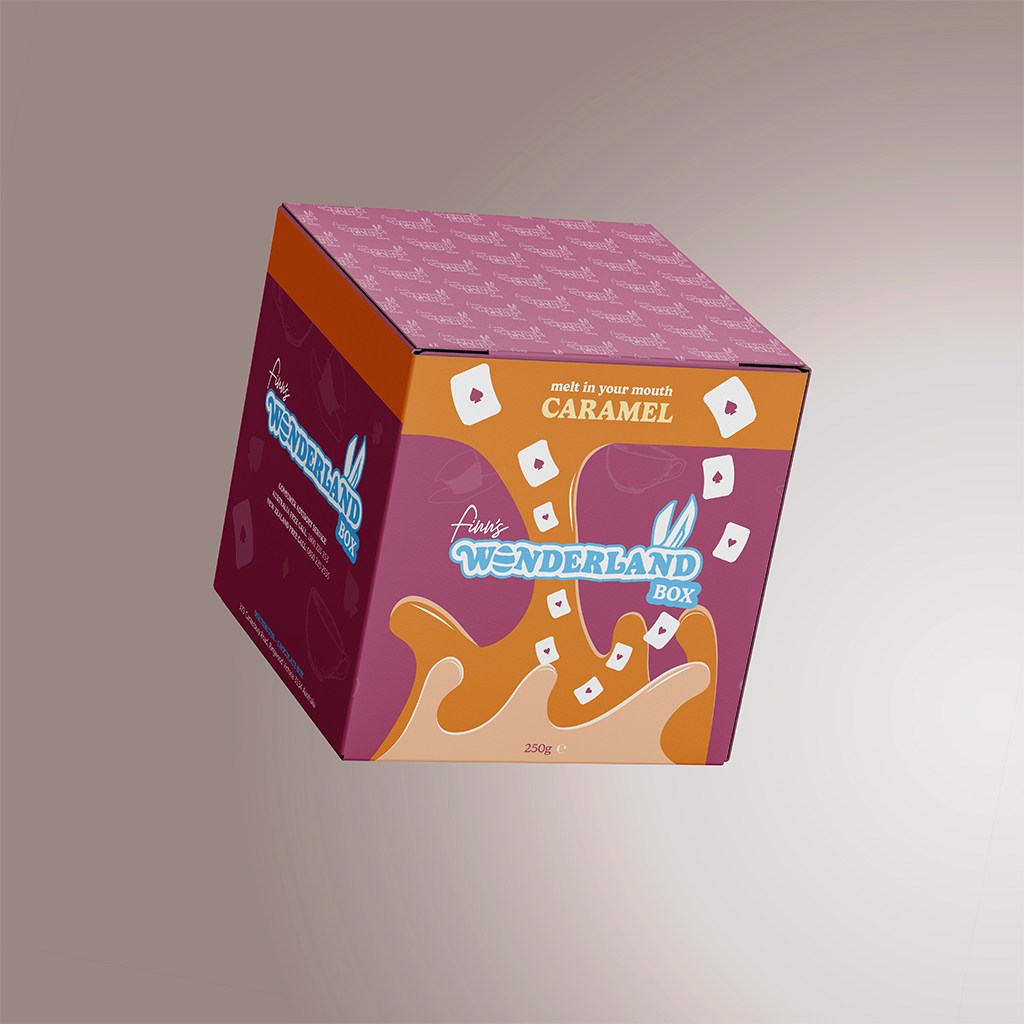
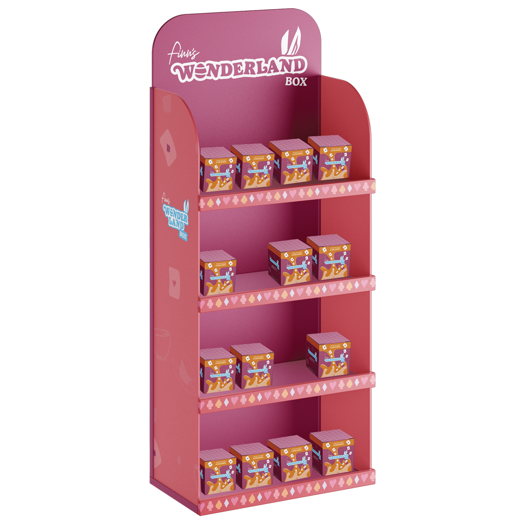
This project utilised mockups from MockupFree.
Adobe Illustrator, InDesign and Photoshop and were utilised in this project.